
11 February 2023 – I don’t have signage even remotely in mind, as I head east on East 5th. I am preoccupied with the extraordinary length of this block — so many streets coming in from the south dead-end right here — and I wondering where & how I can carry on downhill to Great Northern Way, steeply below me to the north.
I am about to turn into a promising short-cut between two buildings in this co-op housing complex… and then see the sign telling me not to.

Look at it. Just a few words, and it manages to be both authoritative & persuasive, all at the same time. It orders me to STOP!!!, but then gives me a good reason to stop. So I do. I walk on to the foot of Fraser Ave…

where the STOP is even more imperious. One word, no justification. But that’s the job of traffic signs — instant one-glance information, for instant obedience. The contrast between these two signs starts me thinking about signage, and it becomes a theme for my walk.
I notice the other traffic iconography at this bend in the road, and then take the unmarked footpath down a shabby but sturdy zig-zag wooden staircase to Great Northern Way.
I’m into signs now! Terse text + iconography yet again, as befits the needs of a major transportation route. Traffic lights, ID for the cross street, “Parkway Bypass” notice with a bicycle logo…

and a directional red rubber glove. Oh, all right, it is not official signage. But I follow it anyway, since I do want to cross Great Northern Way. (Still so-named, because originally it was the route into town for the Great Northern Railway.)
I cross, turn westward, and laugh out loud at the traffic signage right there in front of me. Greenway? Not so green.

And then… and then my friends, some signage that is arguably not signage, since it is non-verbal. But just look at this grouping, right next to the shared bike/pedestrian pathway along this busy road.

Two chairs, and two crocheted hearts. Never mind car fumes, chainlink fence and piles of construction materials. This “sign” says Welcome! Sit a moment! Plus, I do notice an official sign: the logo of the fencing company with its URL, upside down and very small at the bottom of the fence. Then again, this sign doesn’t need to catch anybody’s attention, or persuade/order us to do anything. So, it is doing its own particular job in an appropriate way.
And now, a totally surplus-to-needs photo: a closer look at one of the hearts and how wonderfully it plays off the lines and colours of the fence and the stockpile beyond. (It’s a bonus. You’re welcome.)

More signs-for-purpose as I walk on west: the bicycle logo on this shared pathway, the stripes to indicate a crossing, and the lean, cool lettering on the Centre for Digital Media, as befits both the architecture of this building and its purpose.

I duck in behind the Centre, where construction is underway for the Millennium Line extension (one of our SkyTrain transit lines) that will somehow squeeze between railway tracks and all these buildings.
More signs! The usual terse traffic icons/texts up top; worker-oriented info in the middle; and words + image at the bottom, signage I see on public construction projects around town, designed to win the hearts & compliance of workers and passersby alike.

I walk the back wall of the Centre for Digital Media, and pass a set of classroom windows plastered with post-it notes — the results, one assumes, of some brain-storming exercise.

I realize my brain has auto-flopped the banner words at the top (did yours?) and instantly reads “Solution IDEAS”.
Out the other side, and I’m about to cross from the Centre onto the grounds of neighbouring (and partner) institution, Emily Carr University for Art + Design.
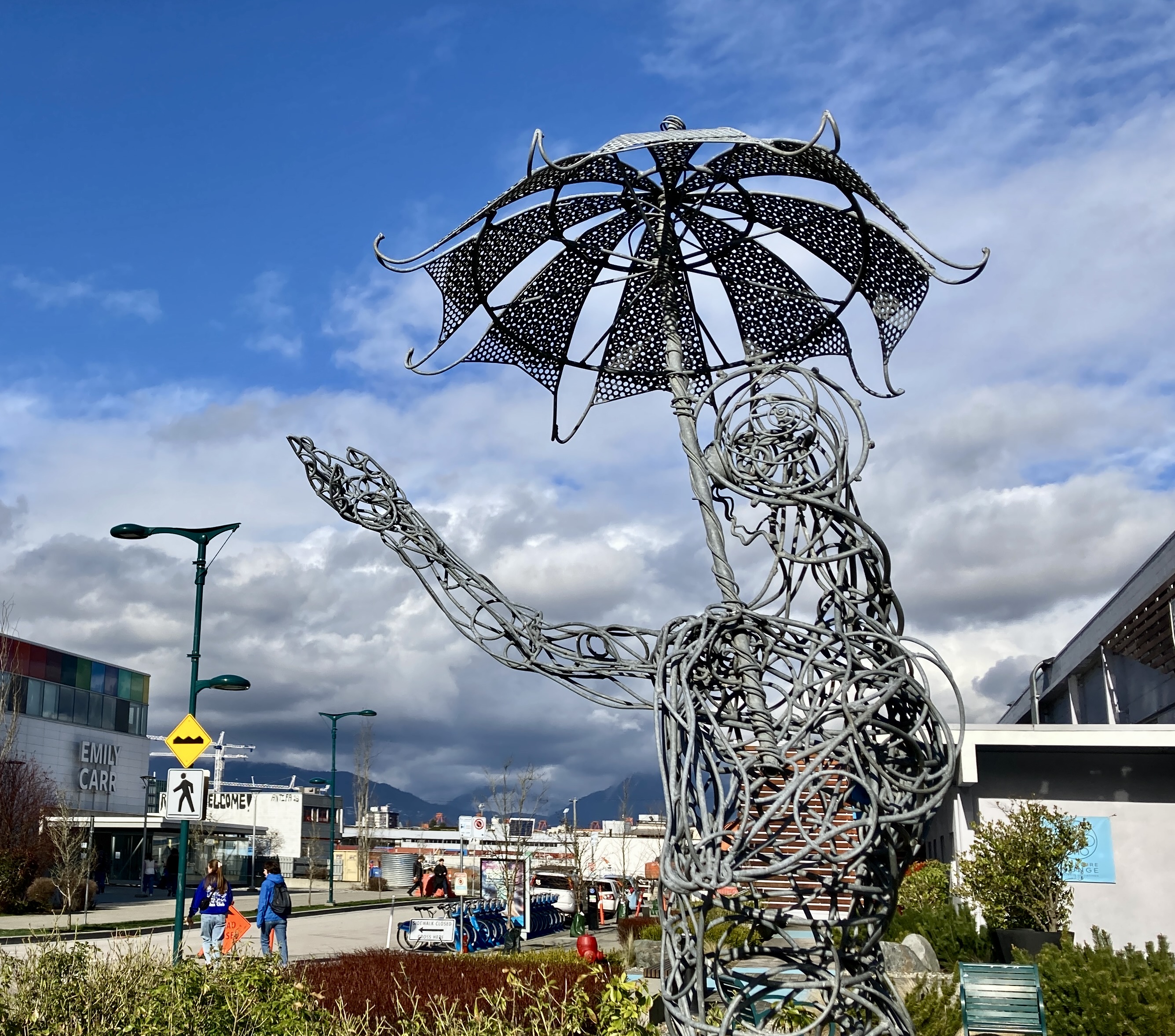
More diverse signage: up close, a sculpture whose body language makes words unnecessary (no, it is not raining); beyond, the yellow diamonds and red diamonds and directional arrows that tell us about bumpy roads, closed sidewalks and detours.
I cut through the Emily Carr campus. Ahead of me, hoarding around the SkyTrain station under construction, with images and words for this largely youthful and heavily design-conscious location: “z” not “s” for South Flatz, 24/7, and fat, bravura graphics.

Closer, a wonderful contrast in transportation offerings. On the hoardings, “new train of thought” and the transit icon heralding the coming SkyTrain line. Right here in front of me, bike parking.

I walk along the hoardings back out by the expressway, where signage is more geared to the general public. The same desire to appeal, to engage, and to be informative, but for a different audience. It’s a conscious effort, and I like it. We’re not being ignored, we are being treated like reasonable and curious human beings, who have a right to know what’s happening and will enjoy learning more about it.
And so, a map…

and a series of graphics about machinery on-site, such as the TBM…

and a follow-up panel that provides more info.

Even private-sector projects now tell us more about what they are doing. (Required by law, I do assume, not from the sheer goodness of their hearts. But welcome, however motivated.) It’s information relevant to us: when they’re allowed to work, what noise bylaws they must obey, how to reach an emergency contact.

And then, well you have to expect it, don’t you? And then, unofficial adjustments to the official template. Somebody scratched out the “ty” in Safety up there in the title, and I don’t think it was “bad Wolf.” I think his style is to add black paint, not remove black letters.
Red detour signs all over the place…

and, walking south again on residential Scotia St, another red sign. It is equally clear and instructional, but gentled by the green vine climbing the right-hand side. As befits the Gardeners of the Galaxy, who run this coFood community garden at East 4th.

One last sign, on the Native Education College property immediately south of the community garden.

Somehow, it rounds out my walk. Like the NWHC sign on East 5th that started this whole sign-mania of mine, it is both instructional and persuasive.


Nancy Loviska
/ 11 February 2023Fun post! Thanks. Does “hoarding” refer to piles of construction materials?
icelandpenny
/ 13 February 2023The hoardings or hoarding is British usage, also used in Canada, for the solid but temporary walls erected around construction sites. They used to be just covered in advertising for various products or events, but current trend is to use the surfaces to provide information about what’s happening and to engage the reader.
Lynette d'Arty-Cross
/ 11 February 2023I like the signs you found, especially the hearts and “solution ideas.” We can all do with that combination now and then. 🙂
bluebrightly
/ 13 February 2023I like “auto-flopped” and yes, mine did, too. But hoardings? That must be a Canadian thing, I don’t have a clue. It’s cool that so much information was made public for the construction project. Seattle had lots of trouble with its giant tunnel-boring machine but that’s history now. Your bookend signs have what Americans would consider typical Canadian thoughtfulness. 🙂
icelandpenny
/ 13 February 2023“Hoardings” is British English, also used here, but obviously not in thre USA since you are the second American to wonder about this word. Sorry for the confusion! It refers to the solid but temporary fencing erected around a construction site. We see them beside us as we walk along the sidewalk, they’re usually covered in deliberate advertising and/or graphics, whether with info about the work being done (a current trend) or just lots of advertising of different products. Also part of the current trend to provide info and engage the pedestrian: you now see openings cut into the hoardings at higher and lower levels, so that people can see what’s going on, on the other side of that wall.
bluebrightly
/ 13 February 2023Thank you! I wonder what the connection is between that meaning and the more common meaning. In NYC they’ve been cutting those holes in fences around construction sites for as long as I can remember – at least since the 60s. They’re fun to look through and of course, there’s lots of slick advertising at construction sites in places like Manhattan, maybe not so much in the outer boroughs.
icelandpenny
/ 13 February 2023Yes the holes aren’t all that new, but at least where I see them, are now more often linked with material on the fence to help people understand/care about what they see. What are those fences called in the USA?
bluebrightly
/ 13 February 2023Fences.
🙂
I don’t know. 🙂